Complex Component Design
Through design system tokens, components designed for Expedia’s Unified Design System are skinned to support multiple brands and both web and native app platforms. Our process for creating components that work across brands and platforms involves an extensive internal and external audit, taxonomy and grouping of like subcomponents, explorations, component construction, and documentation for designer usage and developer handoff.
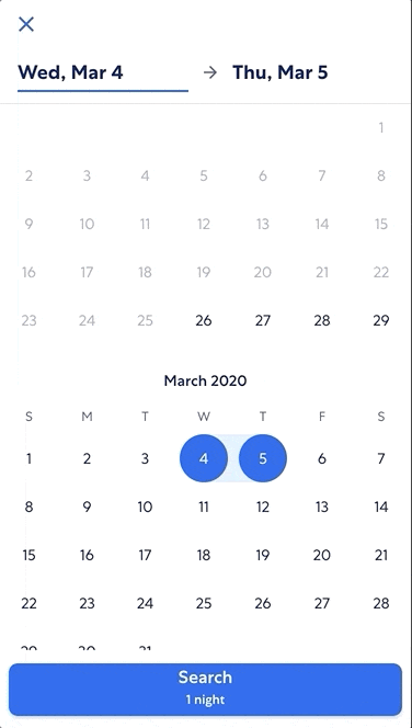
One of the more complex components I designed was our date picker component, which had several varying use cases across our products and therefore detailed design requirements and variations.
Software:
Team:
1 UX
Audit
During the MVP phase of Expedia’s Unified Design System, we decided to scope to just mobile web and native app use cases initially, given that we needed to support mobile-first product tech platform migration while also building out the design system.
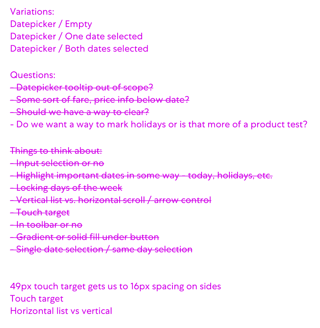
I audited all our internal mobile cases date pickers as well as external competitors’, noting common interactions, component construction, and platform differences. Through this I was able to narrow to a set of design requirements for a cross-platform date picker component.
Taxonomy and grouping
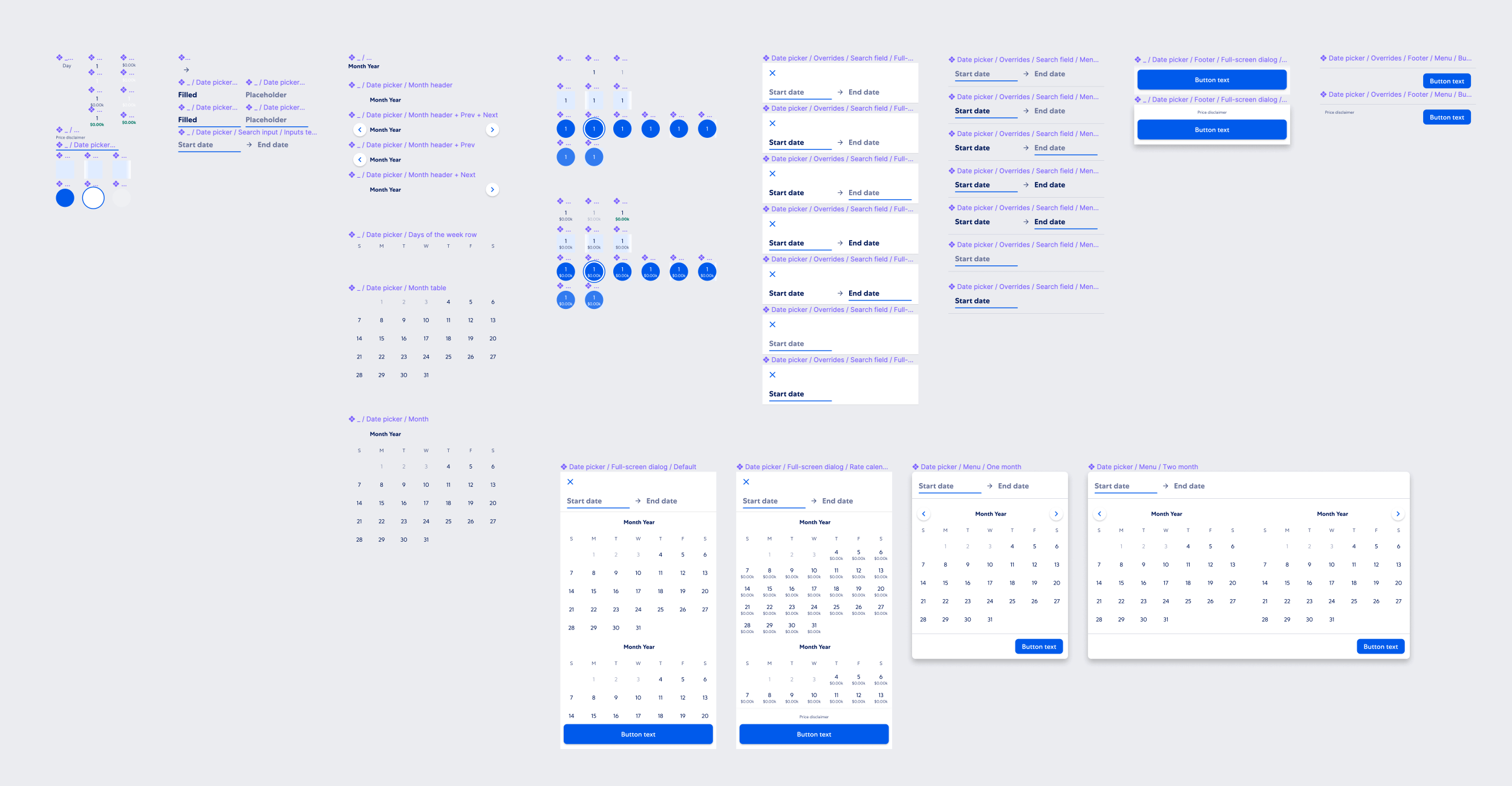
Leaning on the design requirements, I then grouped common use cases into component variations. This helps establish component taxonomy and ensure when naming date picker variations, it’s done in a consistent, scalable way that works within our design tool, tokens, and platform code component libraries.
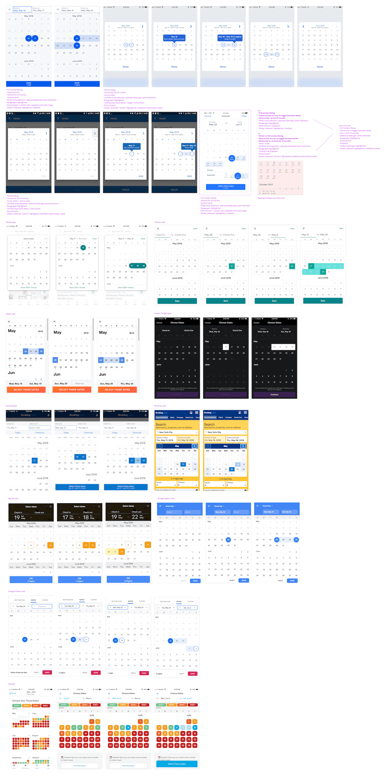
 Explorations
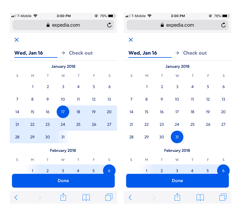
I started broad explorations, looking at different layout and interaction options. Knowing that our typeahead component was already designed and that date picker and typeahead often live together in our various search form experiences, I used that component as a baseline for what date picker could look like.
Along the way I shared explorations with our design system team to get feedback and help narrow down and start to focus on the smaller details like text color and spacing. Once narrowed, I put options back into context and testing each variation with our most challenging use cases to confirm design decisions.

Component construction
Once each variation design is approved by the design system team, I constructed the component in our design tool (originally Sketch, before we migrated our design system to Figma). I broke down the date picker into smaller, reusable subcomponents that can be pieced together to construct larger, more complex parent components which then in turn form the date picker. These subcomponents can then be used by product designers as overrides when using the date picker.
 Documentation and developer handoff
After constructing the component, I created documentation instructing designers how to use a date picker in their work and for developer handoff, detailing component specs. Both designers and developers need to know:
Job to be done of the component and usage, so that product teams can confidently pick the right component for their feature:
Component variations:
Component states: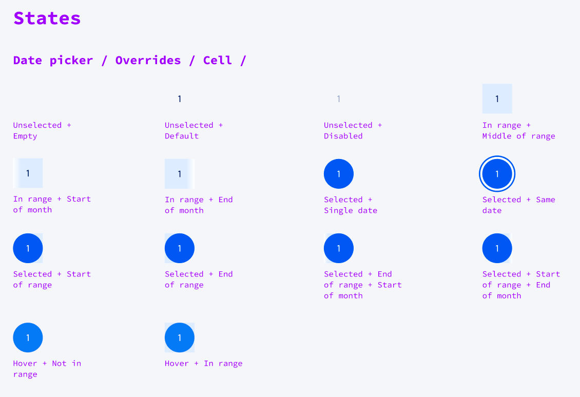
Behavior, animation, and full accessibility requirements: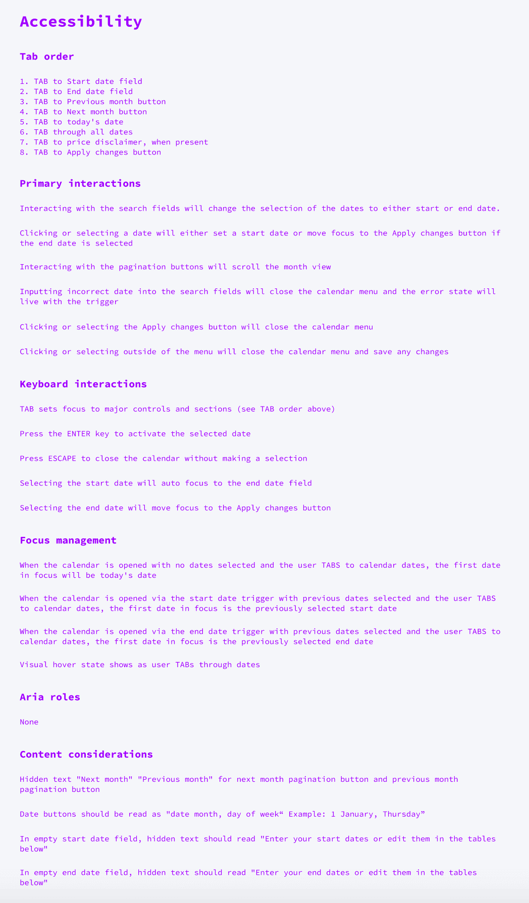
After completion and peer review, I worked closely with our design system engineers to test and QA tokens and component code before it gets deployed to our design system code libraries across both web and native app platforms.