Expedia Lodging Desktop Migration
Brand Expedia’s lodging (hotels, vacation rentals) division began the process of migrating to a new tech stack in 2016. With the mobile migration complete in summer of 2018, my squad was responsible for migrating the desktop experience to the new progressive web app (PWA) platform. In order to do so, we needed to achieve at minimum a 0% purchaser gap between the old and new experience. Over the course of a year, I focused on the migration and overhaul of our user experience across our search results and property details views, in addition to leveraging and extending the new Expedia design system.
Results
Migrated and contributed to new Expedia design system
100% of traffic in all POS on new experience
Gross profit parity between new and old experience for web ads, required in order to accept more than 5% traffic
View WebsiteSoftware:
Team:
2 UX Designers, 1 UX researcher, 1 PM, 1 TPM, Back and front end engineers
Problem
Expedia’s lodging product completed a mobile experience migration to a new tech platform. However, the old platform was still supporting all non-mobile experiences. This was extremely costly both in terms of needing to support two different platforms and in revenue. My squad was responsible for migrating the rest of the experience to the new tech platform while:
- Achieving at least a 0% purchaser gap between the old and new experience and thus accept 100% of all traffic across all points of sales
- Achieving gross profit parity between the old and new experience with our advertising partners
- Migrate to a new design system, resolving gaps between old and new components by either contributing additions or extensions of components to the system, or by using existing components and modifying the new experience from the old.
Process
To begin, I explored different types of search results view-to-property details view flow models based on how we know users shop for travel and lodging (ex: we know users usually jump back and forth between the search results and an individual property’s details) and based on competitive analysis.
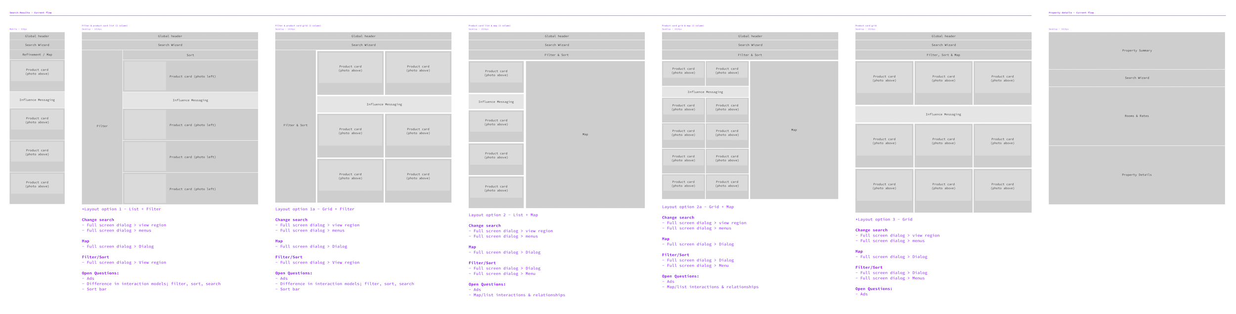
After wireframing near and long term flow ideas, we created a rough test plan for where we wanted to get to for the MVP large-screen experience. I owned the test plan for our search results view.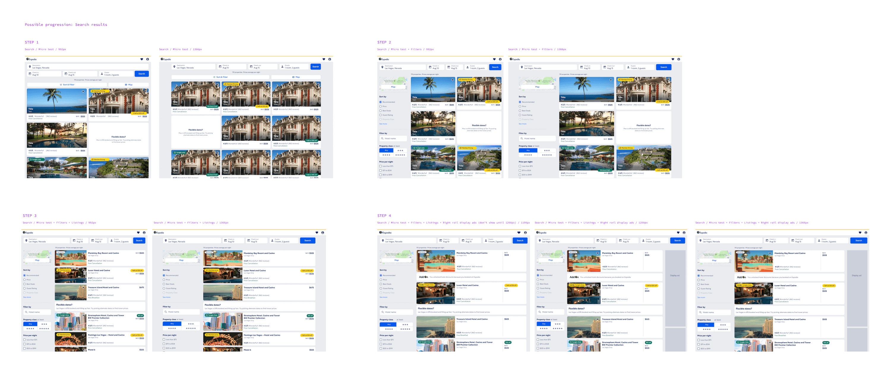
We needed to establish a baseline to compare future iterations to. My first step was to tear down our mobile experience at larger screen sizes and identify what minimum changes needed to be made before launch of our baseline test in order to be MVP usable for our first set of traffic; this was our fastest way to start getting data to help inform future design decisions.
This required I establish a standard set of breakpoints within our design system to capture responsive behavior.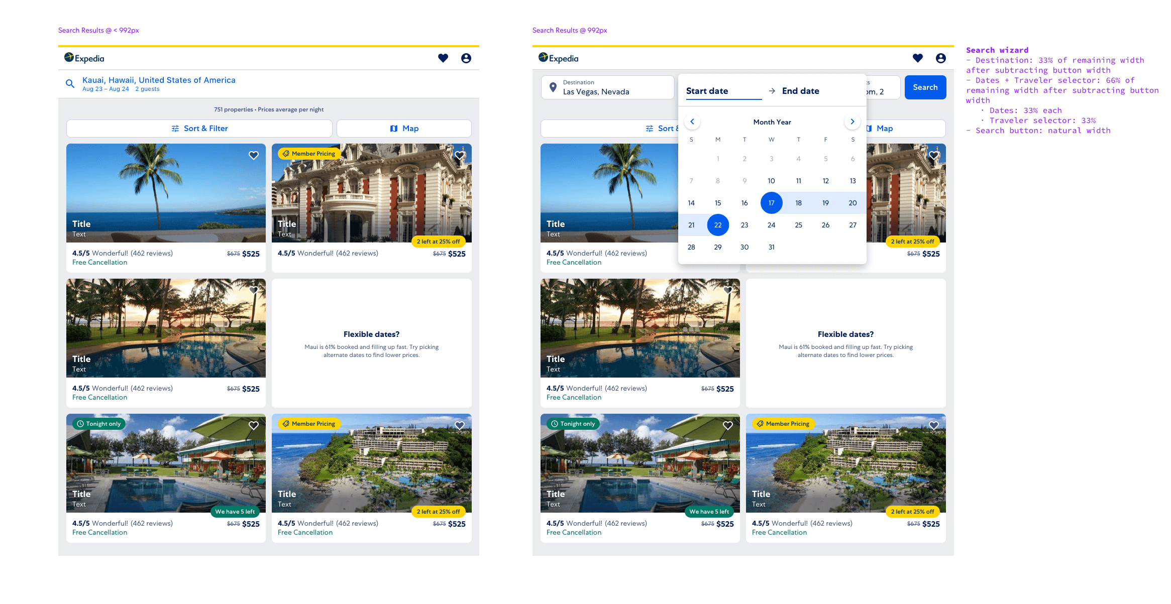 When we launched our baseline experience, we started with a -17.5% purchaser gap in the U.S. point of sale. As is typical of an iterative migration, we had very low traffic in the beginning (~5%) so relying on A/B testing was difficult because of the time it would take to reach significance. Instead we used pre/post testing and user testing to ship and iterate.
One of our first pre/post tests I designed and proposed was to expose sort and filter options in the sidebar, rather than hiding the options behind a dialog, at larger breakpoints. We see this pattern consistently across our competitors and it reduces the number of clicks the user must make to apply filters. Pre/post analysis indicated a reduction in purchaser gap of about 4%.
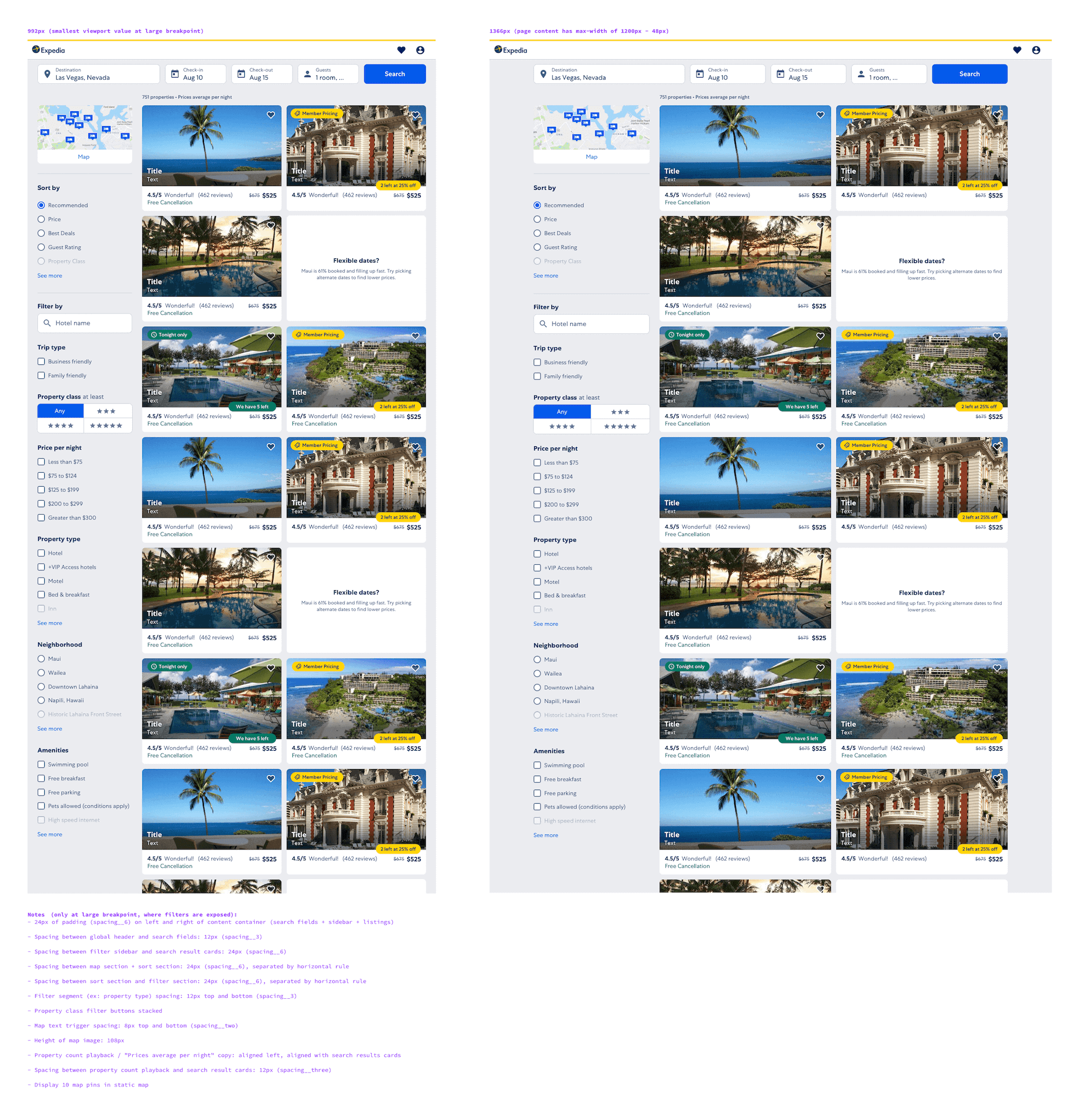
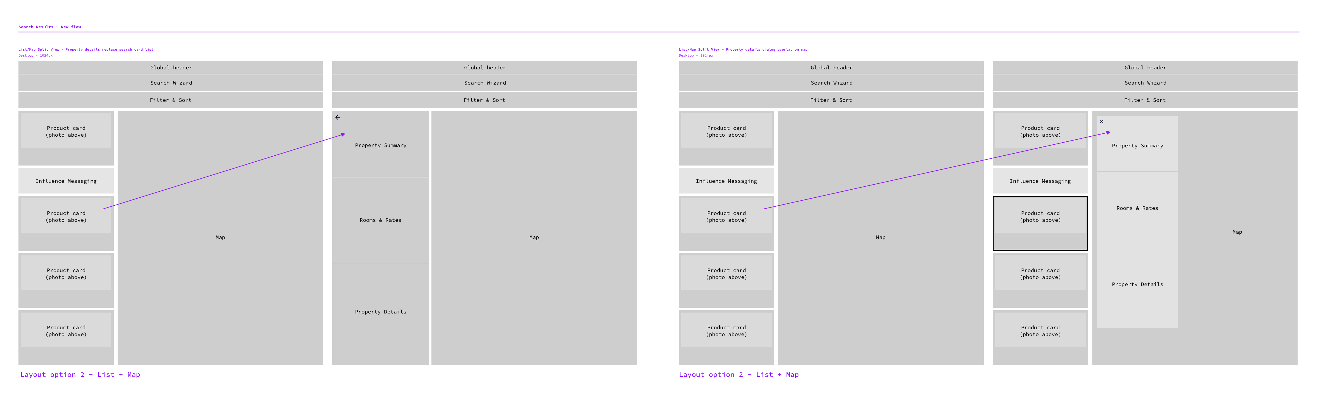
As a follow up to the sort/filter sidebar, I designed horizontal listing-style cards, another common pattern across competitors at larger breakpoints, to be tested. We were initially surprised to learn that pre/post analysis indicated that after introducing horizontal listing-style cards, there was little change in the purchaser gap percentage. Due to this, we plan to test grid-style cards with alternative page layouts, such as a split map/search results view, in the future.
User research
We conducted 2 usability lab studies, which exposed issues that we were then able to triage and implement fixes soon after the test and see positive impact in our purchaser gap numbers.
Several users remarked that they disliked having to go back and forth between results and details pages. We also know from previous user studies that one of the most common ways users compare properties is by opening tabs for each property they are interested in. After the lab study, we tested opening the property details page in a new tab and saw a 3.4% lift in conversion.
We noticed that when users went to change their search criteria, the “search” button was missed often. We concluded that because each search element has its own primary CTA, users believed the page had automatically updated when it actually hadn’t. To solve for this, I diagramed an auto-search flow.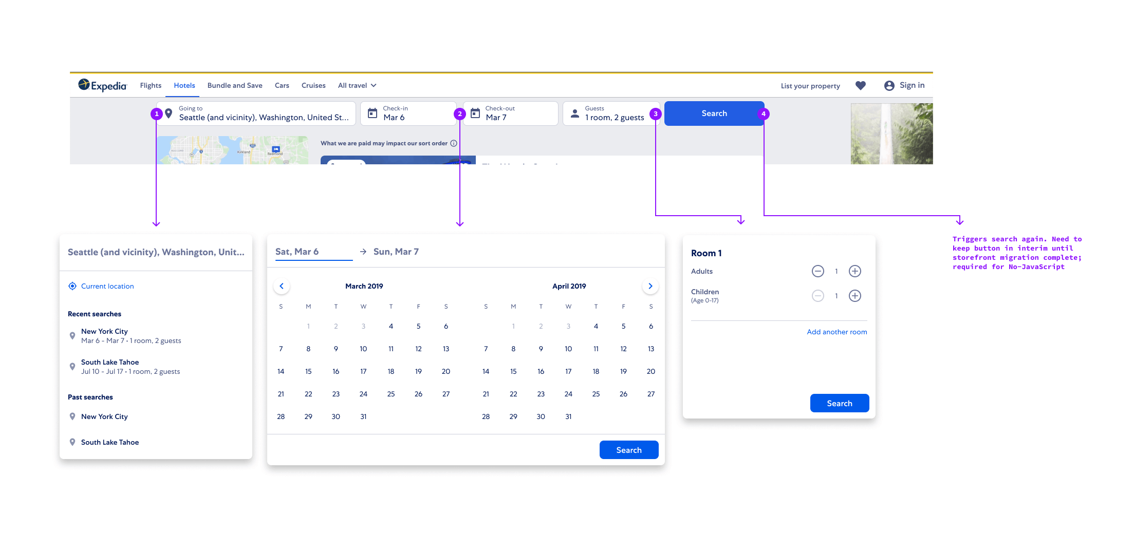
Design system
A major part of migrating to a new platform included integrating into a new design system, creating additional components and extending existing ones for new use cases. Prior to the new platform, it was commonplace for product teams to focus solely on the experience of the pages they owned, regardless of what how it integrated with the Expedia product as a whole. Moving to a design system required a culture shift into thinking about our migration efforts as one part of the system instead of independent from the system.
The system provided mobile versions of certain components, like a destination search or a date picker full-screen takeover. However, I believed using those components as-is on larger viewports was not the optimal long term solution given how we see competitors handle similar components across screen sizes and that disruptive full-screen takeovers didn’t make sense in our use case where destination and date changes are optional. In order to propose an extension to existing components, I needed to provide data to support my proposal. This came in the form of an internal and external competitive audit of use cases, which was used to successfully get buy in from my Product Manager and SDMs.
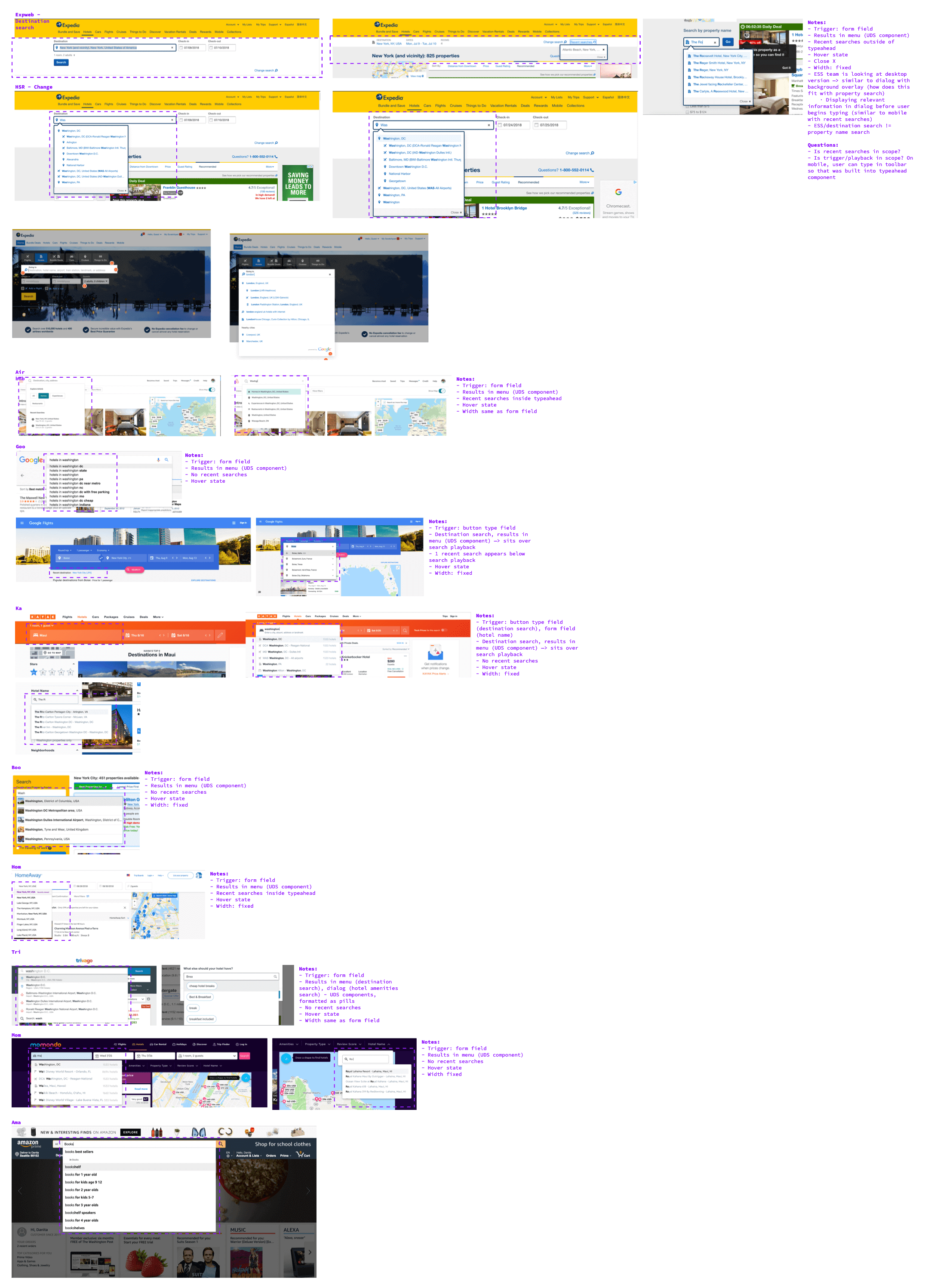
I started wide with explorations and then narrow in on specific design decisions based on our use case.

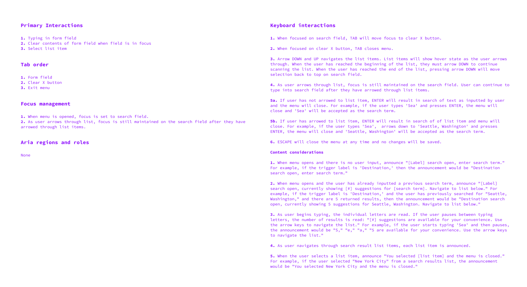
I completed a thorough accessibility audit to ensure that whenever another product team uses this component, they don’t have to spend additional time ensuring the component is accessible before use. I handed all documentation to our developers and complete a robust QA and testing of the component before it is shipped as part of the design system.
What we learned
After a year of testing, bug fixing, and user studies, we fully migrated 100% of traffic from all POS to the new platform and experience. As the first product to fully migrate to the new experience, our learnings have been key in helping future teams plan their migrations.
- A/B testing is difficult during wholesale platform and experience migration given the low amount of traffic, need to use pre/post testing and user research to help inform decisions
- Designing the first iteration to perfection is not practical during a migration; with little relevant data to rely on, it was higher priority for our squad to start testing and get qualitative and quantitative data that may reveal key bugs or experience gaps to focus on first.
Results:
- Migrated and contributed to new Expedia design system
- 100% of traffic in all POS on new experience
- Gross profit parity between new and old experience for web ads, required in order to accept more than 5% traffic
Results:
- Migrated and contributed to new Expedia design system
- 100% of traffic in all POS on new experience
- Gross profit parity between new and old experience for web ads, required in order to accept more than 5% traffic