The Case for Cohesive Product Design
All of Expedia’s product lines are migrating to a new tech platform and design system, and each is on their own independent timeline. One of Expedia’s core tenets of these migrations is cohesiveness across products. In order for each product line to prioritize cohesiveness, we needed to uncover which features and functions can be aligned and which are meaningfully different.
We used this information to create shared “shopping view” templates for each product. I created the initial templates in partnership with designers across products, and am now leading the workstream to socialize the work with product and engineering partners and getting the views built and tested within the product. I created and presented the following document for UX, product, and engineering leadership to kick off discussion around shopping views and product integration.
Results
Shared UI view templates for each of Expedia’s 4 main product lines
Powered the concept of a shared-UI component code library for Expedia
Software:
Team:
12 UX, 1 Content Strategist, 2 UX Research
Traveler problem
As a traveler, I don’t feel confident in finding and booking different elements of my trip. I get different messages and different shopping experiences when shopping on my phone, home computer, or mobile app.
These inconsistencies confuse me and make it hard to trust Expedia is giving me the best travel options.
Business problem
Teams are solving the same UI/UX problems across products and platforms, resulting in:
- Lack of common design standards
- Inconsistent product behaviors
- Duplicated work
- Decrease in overall speed/quality
Goals
Improve customer experience and trust in our brands:
- Fluid shopping experience for customers across products, platforms
- Consistent, learnable UI for common shopping tasks
Improve efficiency of product teams:
- Reduce duplication of design, dev and experimentation, creating more opportunity to explore other areas within product teams à efficiency
- Simplify and speed up feature development
- Uplevel designers across products, platforms to become design system leaders on their teams
The effort to define and execute cohesive product design aspires to address these goals.
The case for cohesive product design
Based on internal and external user data, our user research and core tech strategy team put together a research paper defining cohesiveness at Expedia:
Cohesiveness is the quality that ensures all touchpoints, end to end, fit together in a way that feels seamless to the customer. A cohesive experience:
- Increase traveler confidence
- Reduced cognitive load
- Increases positive emotions
- Increases trustworthiness and brings travelers back
Shopping views: what could cohesive product design look like?
Shopping views is a discovery exercise to uncover meaningful differences between experiences and opportunities to align, while also testing new working models and processes across teams that have traditionally been siloed.
Focus areas:
- Consistent and learnable UI for common shopping tasks
- UX/UI optimizations designed at scale
- Highlight product design partnership opportunities
Cross-team partnerships:
- Design system champion product designers from our core product teams
- Design system core team
Process
Abstract views
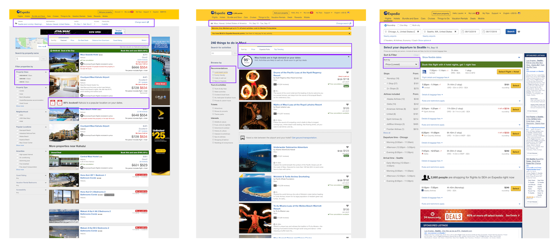
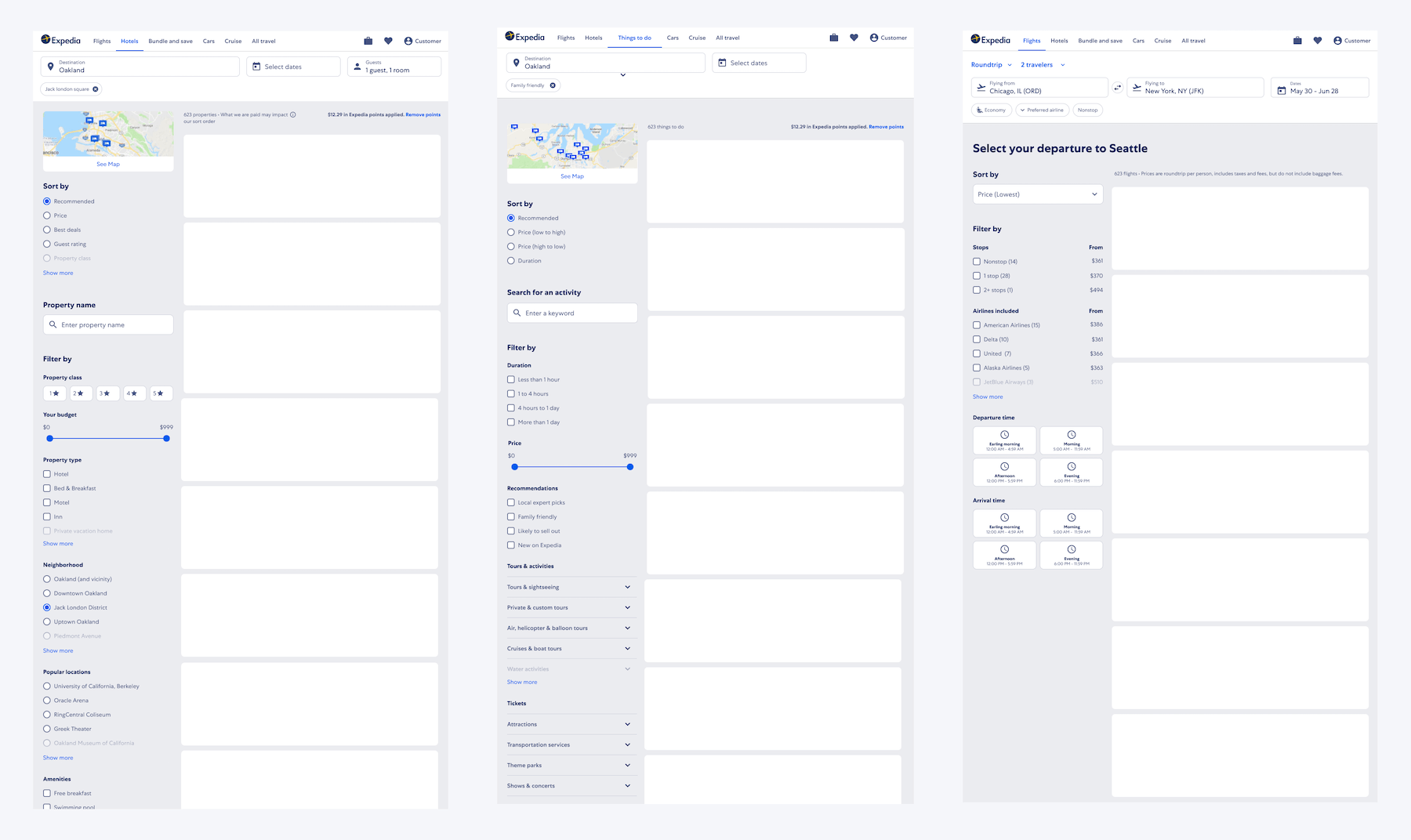
In order to identify what views to focus on, we needed to capture current alignment and divergence in our products. We audited each of our four major products (lodging, flights, activities, and cars) across both web (mobile and desktop) and native app. We took notes along the way of how each product handled certain features that were repeated across business lines.
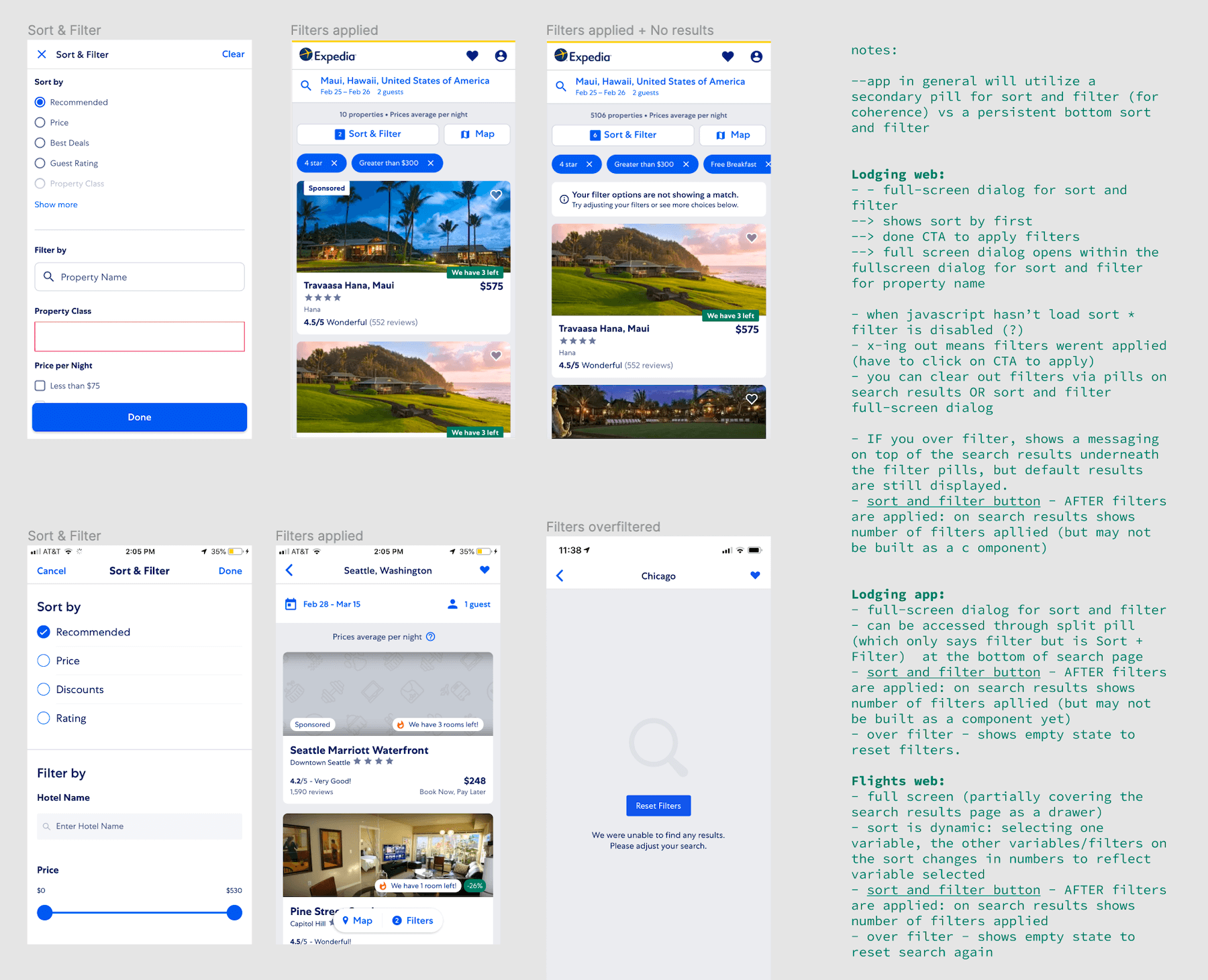
Reviewing our notes with a wider lense, we identified six common features and views and what we believed could be shared across them:
- Sorting and filter: placement, trigger to open sort and filter, interaction design, visual design, component usage
- Map: trigger to open map, interaction design, visual design, component usage
- Trip search and changing search criteria: interaction design, visual design, component usage
- Search page: layout, typography, spacing
- Product details page: layout, typography, spacing
- Loading state for search and product details pages: component usage, transitions, motion
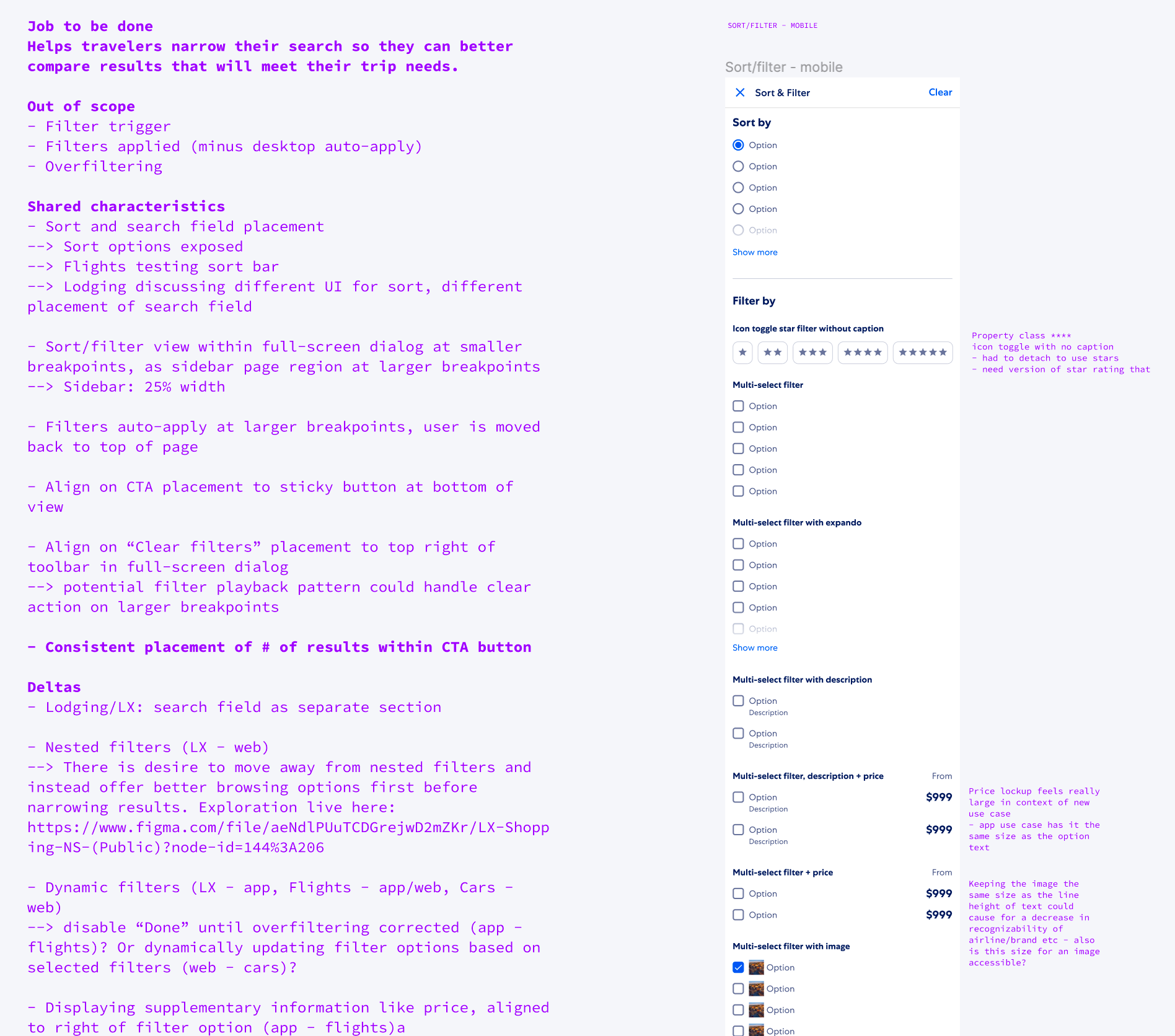
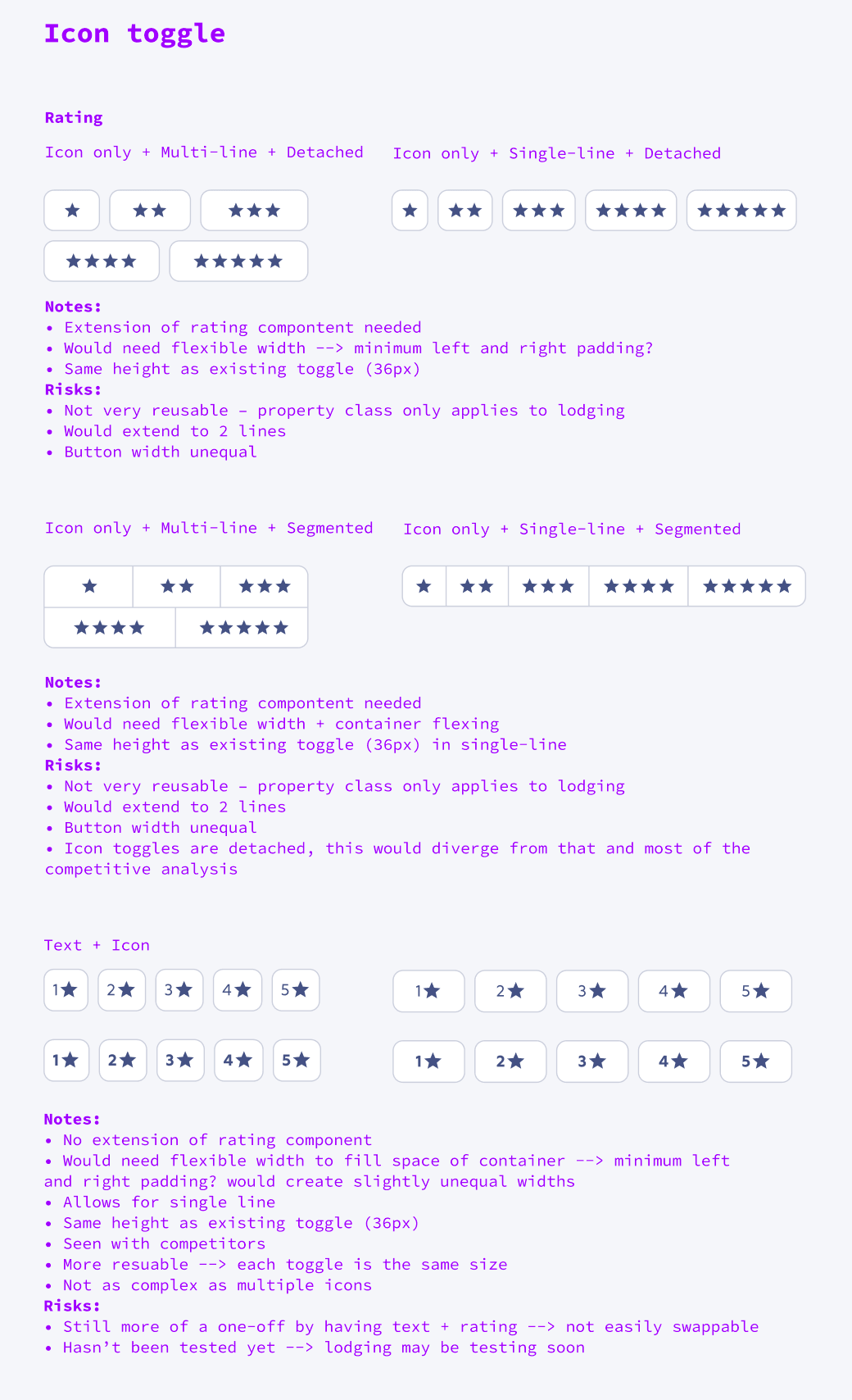
Within each view there are product and platform specific differences that need to be accounted for. For example, we can generally use the same components and interactions for each product’s sort and filter view. However, each product requires different types of filtering options based on what they sell: Lodging and Activities require an extra form field feature because they allow the user to search by a specific hotel chain or activity provider. We take these differences into account when exploring designs for the shopping view templates.
In addition to identifying shared characteristics and deltas, we captured any potential new patterns or components that didn’t already exist in the design system and that may require further exploration.

Exploration
The template exploration phase involved exploring design variations for layout structure and positioning, consistent and hierarchal application of typography and spacing, consistent and learnable UI interactions, and component extensions and additions when needed. We ensured each decision point along the way by placing designs back in context of the product or platform, building the shopping view templates feature by feature.
Merged views
Once we explored and narrowed design options, we merged all shopping view templates together, highlighting key differences between products and platforms.
Where we made decisions introduced brand new features or functions, we worked with our research team to set up usability studies, confirming or iterating based on feedback.
What’s next
I identified three possible working models:
- Work across all products and platforms simultaneously
- Shared pieces of the UI must be considered across all products and platforms
- Test simultaneously
- Rollout everywhere with an overall positive or no harm test
Risk: Product decision making is dependent on shared decision making = slow
- Primary/core product works in silo, other products and platforms standardize
- Design system considers cross-product/platform use cases and scales
- Primary product prioritizes and uses scaled solutions when it makes sense with their road map
- Standardize and evolve the system everywhere else
Risk: Primary product isn’t as cohesive as the rest of our experiences. It has less influence on the evolution of the design system. May not be able to take advantage of server-driven UI. Product decision making still dependent on shared decision making = slow
- Primary product/s lead the evolution (current model)
- When considering shared pieces of the UI, primary product use cases are prioritized for testing, while ensuring they can scale across other products and platforms
- Each product’s designer scale design to their product or platform
- Test on primary product/s
- Roll out everywhere
Risk: If a solution doesn’t scale, there will be asks on the primary product to update and test a solution that does.
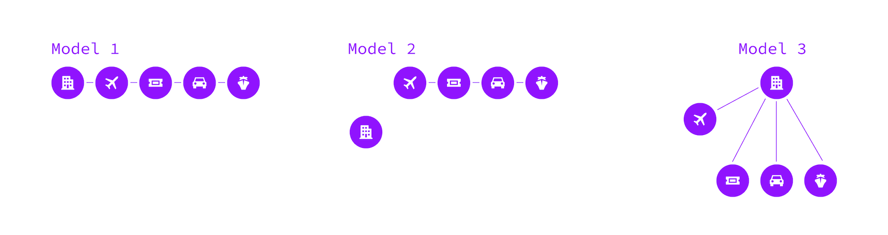
We are now in the process of testing working model #3, given it most closely matches our current model and will be the most efficient path toward get learnings about the view templates, cohesiveness across products and platforms, and how we work as an organization.
What we learned
- Prototyping cross-product and cross-platform team showcases the alignment opportunities available and how we can rapidly capitalize on them
- When features are shared across product lines and platforms, we may need to follow a different process to understand impact across teams. Ultimately this will lead to improved efficiency and consistency in experience.
Results:
- Shared UI view templates for each of Expedia’s 4 main product lines
- Powered the concept of a shared-UI component code library for Expedia